The Facebook Messenger Application for Android

Now, if you don’t know what Facebook is, you don’t deserve to be reading this article so click off and go and read something else. For the 750,000,000 users that do know what Facebook is, then carry on reading for an insight into the Facebook Messenger application for android.

Recently Facebook has been changing all over the place with a new layout to the homepage (including the stalker feed on the top right) and new options and things being moved about all over the shot. Now, I’ve been a little sceptical to these changes because I’ve always believed if something isn’t broken, don’t try and fix it and by moving things around, Facebook and Mark Zuckerberg have confused a lot of Facebook users. However, one thing that I have really liked about the recent Facebook changes is the way that messages and chats are handled. Messages have changed in that you can pop up on chat to someone and if they aren’t online, it sends them a Facebook Message instead of waiting until they’re online to send the chat Message. Now, with this service in place, the Facebook team felt that it was suitable to make a Facebook Messenger application to almost replace modern email completely.

To begin with, you may feel that by me saying that it will replace modern email completely is a bit of an over exaggeration, but if you think about it, nearly everybody you know has Facebook don’t they? However, do you know all of their email addresses? Probably not. I admit that Facebook is possibly for the younger generation, but that just enhances my argument Facebook messages will replace modern email. The current population of 12-20 year olds will communicate over Facebook; if they want to talk to their friends they will leave them a comment on their wall, or if they are online will chat to them that way. In addition, with all Smartphones having push notifications these days, every one with a smartphone can receive the message almost as instantly as if they were sitting at home on their Facebook page. Another thing is that with the new messaging system, if the person that you wish to contact does not have a smartphone, Facebook will text them the message that you have sent (assuming they have their number on their profile) and they can reply by simply replying to the text. One last thing that helps my argument that this form of messaging will replace email is the simple fact, everyone now has an email address that if you are in an email application, you can email and it will send them that message in their Messages; genius!

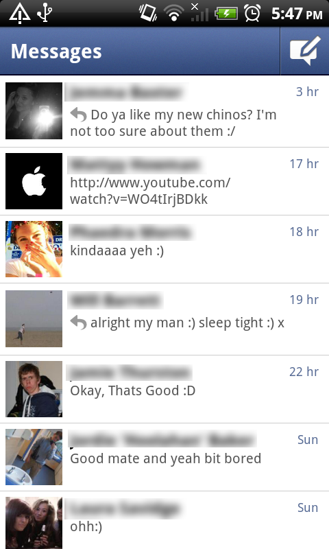
I’ve rambled on about the new messaging service for Facebook enough, let’s get down to the actual application for Android. The application is set out so simply, but so well! When you open the application you simply have your feed of recent messages with each contact which you can access by clicking on the name of the person you wish to chat or respond to; you also have a compose message button.
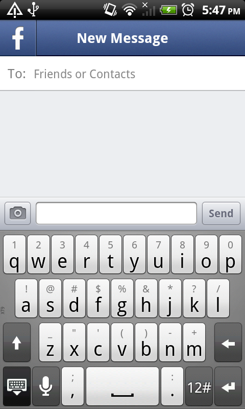
When you click the button to compose a message, you are brought to a screen with a very similar design to the previous, but now you have an option in the top left (signalled with the trademark facebook ‘f’ logo) to take you back to the messages screen. When choosing the recipient you wish to send the message to, you simply start typing in the name and it brings up your friends with that name. One addition I like to this is that if they aren’t online it will show a little mobile symbol next to it, signifying that it will send it to their mobile app. Also, you can choose to send the person a text message from Facebook instead of leaving a message in their inbox. Just like the new Facebook chat and Facebook messaging service, you also have the ability to start group conversations with multiple friends on Facebook. Furthermore, in this screen, you have the option to add an image by choosing one of the following options: Take Photo, Choose Photo or Image Search. Another final feature is that you can add your location to the messages that you send (bit creepy and I’ve never used it, but nice to know it’s there.)

In the options you get the ability to alter the notifications with such things as whether it vibrates, whether it makes a sound, what sound it makes, that type of thing. Other helpful information to know is that you can either refresh by pulling down and releasing, or you can hit the menu button on your phone and choose refresh. Simples.

I have found myself using this application on countless times, in fact recently I received a message from my Network asking if I was still using my mobile as I had only sent like three texts in a month. I use this application more than I use any other form of messaging service. Even though you do get a message option within the Official Facebook app, I find this just quicker; you simply open the app, click compose, type the name, type your message and boom, you send it away. Such a simple application, yet such a useful one and a genius move by Facebook if you ask me; it just needs more publicity and maybe iOS and Blackberry versions to properly excel this application into one of the highest in the market.

Written by Luke. Twitter @l_harknessYouTube Channel


Comb Over Charlie HD for BB PlayBook

Comb-Over Charlie HD is a very addictive, yet simple game for the Blackberry PlayBook. It is one of those games that you can play for hours and have not really accomplished much by the time you have to stop.


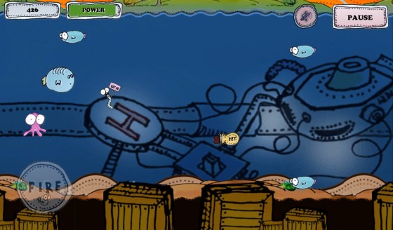
Comb-Over Charlie begins with a simple opening menu that lets you access everything you will need to access to enjoy the experience of the game. I really liked the font and design of this game as it gave it a childish yet at the same time mature look to it; very clever design. Anyway, on the first screen you are given four buttons to choose from: Play, Help, Scores and Thanks. Hitting the Play button obviously take you to the next screen from which you can start playing, but I shall get back to this later. Help takes you to a little image-by-image tutorial that you can slide through that gives you simple instructions on how to play the game. Scores brings up your highest offline scores (no online scoring enabled as of yet.) And the Thanks options brings up an image that shows who the game was created by and who they owe additional thanks to.


Now, when you click Play you are taken to a different screen that lets you select which level to wish to play. However, as with most games, you can only select the levels that you’ve already played and therefore have already unlocked to play. There are eight levels to beat in the game which isn’t a lot, but it took me a good couple of hours to complete them all (mainly because I am appalling at the game.) You also are given star ratings on each of your levels (similar to Angry Birds) based on your score. The controls for the game are very simple, you tap on the screen to make Charlie go up and you click the fire button to fire in a straight line.


The downfalls of Comb-Over Charlie are quite evident from the beginning; although I’ve raved about its simplicity, in a way it’s all most too simple. There are no transitions in this game, the screens just feel like pictures that have links on them instead of pages that interact with one another. Another downfall is the mere lack of actual levels; even though I said that there was enough to keep me entertained for hours; this was merely because I am terrible at this game. I couldn’t see somebody who spends a lot of time on tablet games taking very long on this game at all. It would also have been nice to see other game modes other than just the basic, also some new weapons and a lot more content in general. Basically the big downfall of this game is that it is too simple for my liking.


Comb-Over Charlie HD is a very addictive game however, it is addictive in that you don’t have to really push your mind to play it, so even when you fail, it doesn’t feel like you’ve lost a lot. This game wins for me because it’s a game you can easily pick up and get straight into playing with the simple navigation to a new game and the ability to select a level you’ve already played. Check out this game if you’re looking to kill off some time in a long car journey or in a waiting room.


Written by Luke. Twitter @l_harknessYouTube Channel

ScrapBook on the Blackberry Playbook

The Scrapbook application for the Blackberry PlayBook is a beautiful pictures application in which you can create nice collages of photos that you've taken.

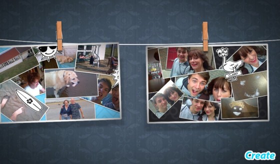
When you open up the Scrapbook app, you are introduced with a washing line which your completed colages will get pegged to when saved. Also, there is a 'create' button in the bottom right of the start screen to begin creating your collage. This homepage is possibly one of the nicest start screens of any application out there for the PlayBook. It is a physics-based homepave in that when you scroll through your collages left to right, when you reach the end they swing out as if you were really sliding pieces of paper on a washing line. The image previews also look 3D which adds to the beauty of the animations and the idea of it being a washing line of pictures. When you click on one of your images, it simply pans in to show an enlarged preview of your image. Which, when you tap again, it pans out to the washing line view again.

When you click create, this is where the countless fun begins. You are brought to a very basic screen that shows a canvas as the main attraction of the screen. On the right you have three tabs that open up your images, stickers and wallpapers. In the bottom right hand corner you have a bin where you drag items that you wish to remove. And on the bottom left you have a camera button that is your save button; which you should be careful when hitting because, once saved, you won't be able to edit your collage. Anyway, clicking on the images button will bring up all the images that you have taken with your PlayBook's camera and you drag these onto the screen and once released they drop onto the piece of paper. It is exactly the same with the stickers, you pick a sticker, tap and drag to where you wish to place it. With the wallpaper, you choose which one and it will change to that wallpaper, simples.


There are a few features that keep this from being a simple and dull application. Such features as the ability to readjust and twist images using multi-touch pinch-to-zoome. The multi-touch is a little off and laggy sometimes, but it isn't so bad that it stops you from putting the image how and where you want. Another feature that the Scrapbook application has is the ability to connect the app up to Facebook; this enables you to post the finished product to Facebook when it is finished. 

However, this beautiful application does have quite a few downsides and there are plenty of things I would add in to make it a better application. The first downside I noticed was the lack of ability to edit your collage once you have saved it, as I mentioned earlier. Another downside to this app is that you can only have a certain number of your images in a single collage (I believe the limit to be seven). However, you can still add in stickers after your image limit. Things I would add to improve this application would be the ability to add in some form of text, such as bubble writing or maybe even just a text box. Also, seeing as Facebook is connected, maybe the ability to use your Facebook photos within the app would be a nice feature.

The Scrapbook application for the Blackberry PlayBook really shows off the PlayBook's graphical prowess. It shows off how good of an application can be made on the PlayBook; which makes me doubt other applications that have no transitions or animations. I cannot praise the developers of this application for the clear amount of time they have spent making this a beautiful application. It lacks some features that would make it a more useable application, but then no application is perfect. And for what this app has set out to do, it does extremely well.

Written by Luke. Twitter @l_harknessYouTube Channel

Vevo for the Blackberry PlayBook Review

Vevo, for those of you who don't know, specialize in music videos. They have many artist-specific accounts on YouTube and also have a website similar to Spotify where you can add music videos to a playlist. The PlayBook application isn't too dissimilar to this.

I'll begin with the main home screen of the Vevo application for the Blackberry PlayBook. When opened up, this application instantly shows up some simple yet impressive animations. You have large tiles of videos that can be clicked on to access the video (usually music videos, but sometimes interviews or celebrity playlists) which slide left or right with the swipe of a finger; the tiles do automatically slide also. You can drag from the top to drag down your own created playlist (which I shall discuss later) which gives you the option to edit, clear or select a new playlist. There is also a search box in the top right that searches for either artists or song name. Along the bottom of the home screen, you have have buttons to look at: featured videos, other videos, artists and playlists. 

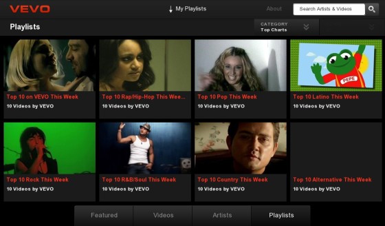
Now, clicking on these four options along the bottom will bring you to the appropriate page. The 'Featured' tab is what the application opens up in and features featured videos that Vevo has selected (usually promotional videos of new songs). Clicking on the 'Videos' tab will bring you to a whole new screen. Within this screen you're given three drop down menus: 'Category', 'When' and 'Genre'; these are filters to help narrow down your results.  This is a feature I have found myself using often when I have time to kill and are just looking for some music to listen to that I wouldn't necessarily choose to download myself. The third tab, the 'Artists' tab is similar to the 'Videos' tab, but shows artists instead of songs. This screen also gives you the same three drop down menus of: 'Category', 'When' and 'Genre' helping you filter which artist you wish to listen to. The final tab is the 'Playlist' tab which simply shows playlists that Vevo has pre-selected. There are twelve different pre-selected playlists, all of which are 'Top 10...' and then different genres, for example, 'Top 10 Pop this week' or 'Top 10 Rock this week'. These are good, but I have noticed they aren't updated very often. You also get a drop down menu that lets you choose: 'Top charts', 'Celeb Picks', 'Recently Added' and 'My Playlists'. 

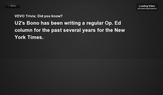
When you have finally chosen a video after seeing all these options and being undecided as to which video to actually choose, you are quickly given a piece of short trivia whilst the video loads, all of which I found very interesting and a nice feature to kill time whilst rhe video loads, not that that takes long at all. After this trivia is shown, you are shown the video in full screen. And I must say, every video is in brilliant high quality and all stream beautifully fast and well. However, at first, it looks as if there are no options within the video, but with a simple tap of anywhere on the screen, you'll be given plenty of options. In the bottom top left you are given the 'info' button that brings up information about the video that is playing, doing this does not slow down the video at all. Next to that is the share button that allows to share with either Facebook or Twitter; a simple but nice feature. You also have an option to buy the song which nicely opens up the 7Digital Music Store on your PlayBook; however, this only searches the song in your store and doesn't take you to a direct option to download the song. The final option along the top of the video is to add it to your own personal playlist, which I find the neatest feature of this application. In the bottom right of the video you have the option to minimize the video, which allows you to see more from the same srtist or related videos. You also get a mute button and obviously your play button in the bottom left that doubles up as a pause button. You can't drag the music stream bar a long the bottom, but can tap to move onto certain places in the song.

Things I really like about this app are the supreme quality of the video and how it manages to render this video. I have a fairly poor internet download speed and it manages to stream every song perfectly without any buffering. I also like all the filtering options that it allows so it is easy to find the song or artist you wish; this is also good for time killing when you're looking for artists or songs to those that are similar to your tastes. My favorite feature has to be the ability to add songs to a playlist though. There have been many times when there are certain songs I can't download or can't be bothered to download and so I just stick them in a playlist in my Vevo app. However, unfortunately, your playlist can't be played offline.

This application isn't perfect though (even though i've sung its praises up until now) and does have a few minor faults that could be changed, added or removed. Even though 8/10 times, the video you select does play, 2/10 of the times it doesn't. It will either refuse to load or you'll be given a message saying something about how the selected video can not be played. I have also had problems with the simple loading of the application, for example, before I began to write this review, I had to uninstall and reinstall the application as it simply refused to get past the opening title screen. A feature that could be added is the feature to be able to name your playlists and be able to shuffle or repeat and such things within them. Also, I would also like to see a few nice animations built into the application to really give it that premium polish that would make this app truly stunning.

Overall however, I have truly enjoyed using this application so far, apart from it's little problems that can easily be sorted in an update, this application works really well. I would highly recommend this application to any avid music video or music fan as the features such as filtering and playlists make this a very good music searching and playing application.

Written by Luke. Twitter @l_harknessYouTube Channel